Visual Audit
In 2020, BDT was planning a website redesign and in need of a more updated use of their branding. After a visual audit, it became clear the use of typography, colors, iconography, and imagery was inconsistent across all materials. An established look and feel was developed, and we needed to educate employees on how to implement it and adhere to the new system.
Visual Identity
Color + Typography + Iconography
Typography
We address the typography by establishing Myriad Pro as the primary font for marketing materials and Calibri as a secondary font for use cases like PowerPoints and Word so the documents could be shared externally. We eliminated the use of condensed fonts, and established sentence case as the standard for headlines. For web, we chose to use Avenir Next who’s personality, friendliness, and legibility would appeal to all markets visiting the site: customer, clients, partners, funders, and potential or current employees.
Typography for Bdtrust.org
Typography for Marketing Collateral
Typography for Office365 Documents
Color
When we established the color pallet, accessibility standards were considered for pairing text color and background color. We also altered the ratio of colors being used, adding the guidance chartreuse would be used as an accent color as opposed to part of the primary color palette. We also introduced the use of gradients, with the blue gradients being used as background colors, and the green to light blue gradients used as accent lines and elements.
Iconography
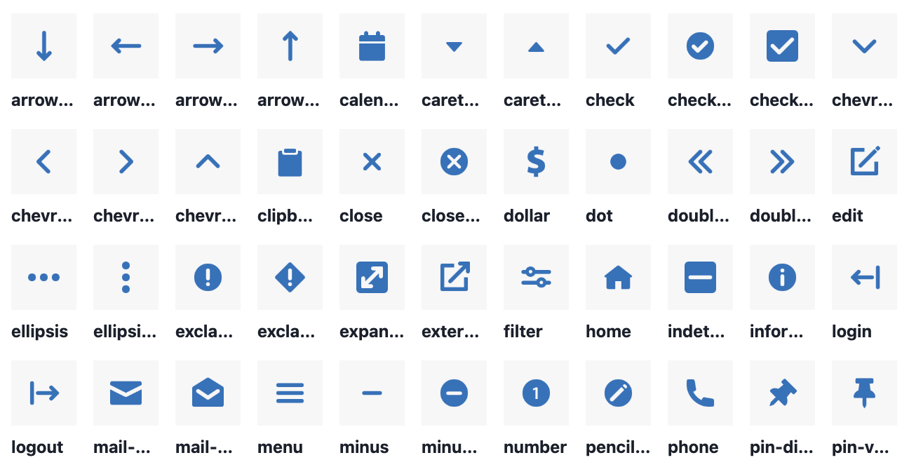
To establish consistent Iconography we broke it into two categories, standard and isometric. You could imagine these as Product and Marketing icons, but they get used across both functional areas. Our standard icons are simple and provide utility, while our isometric icons are more detailed and expressive. Isometric Icon renders ideas clearly through shape, simplicity, and depth to allow for multiple icons to work within the same live area.
Website Redesign
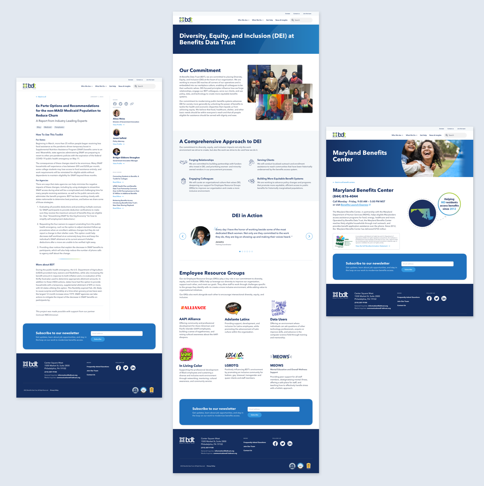
This update was geared to make audience specific content about BDT’s work easier to find, and to better convey the scope and breadth of BDT's services, while meeting other organizational needs. Another goal of this redesign was to serve as a place that helps legitimize outreach clients receive so they know it is coming from a trusted source. A fresh feel, a new look, contemporary UI components, and updated messaging help to achieve this.
To view more, please visit bdtrust.org.
Marketing + Outreach Collateral
Playbooks + Presentations + Reports + Toolkits + Flyers + Posters
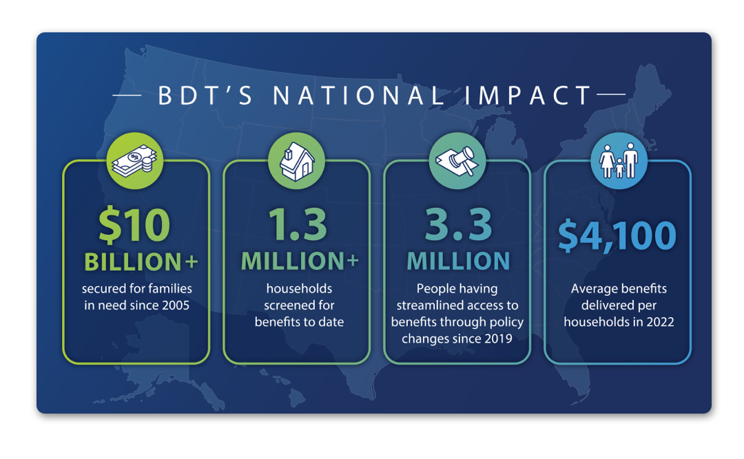
While collaborating with the Marketing team and other departments at BDT such as Healthcare, Policy, and Implementations. There was a need for materials to educate partners, clients, and funders on available benefits, and how to address the $80 billion benefits access gap. These materials have been printed and handed out to clients and caseworkers, and shared digitally over email, in presentations, blog posts and disseminated to partners.
In collaboration with Dennis Tolan and Marisa Diaz.


